Project: Bag and Checkout redesign
Platform: iOS and Android
The Challenge: The bag and checkout experience was very dated and difficult to navigate through. We wanted a more streamlined process to get more users to convert without much frustration.
Role: UX Designer, UI Designer for Checkout
Solution
App users are our most loyal customers and delivering a seamless experience to them helps build trust and increase ROI. Giving the users quicker options to checkout and clear and concise sections helped to clean up a lot of confusion and customer frustration. We now have clear places to add promo codes, sign in and use rewards, and add gift cards.
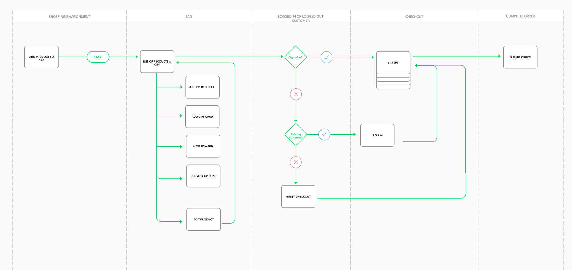
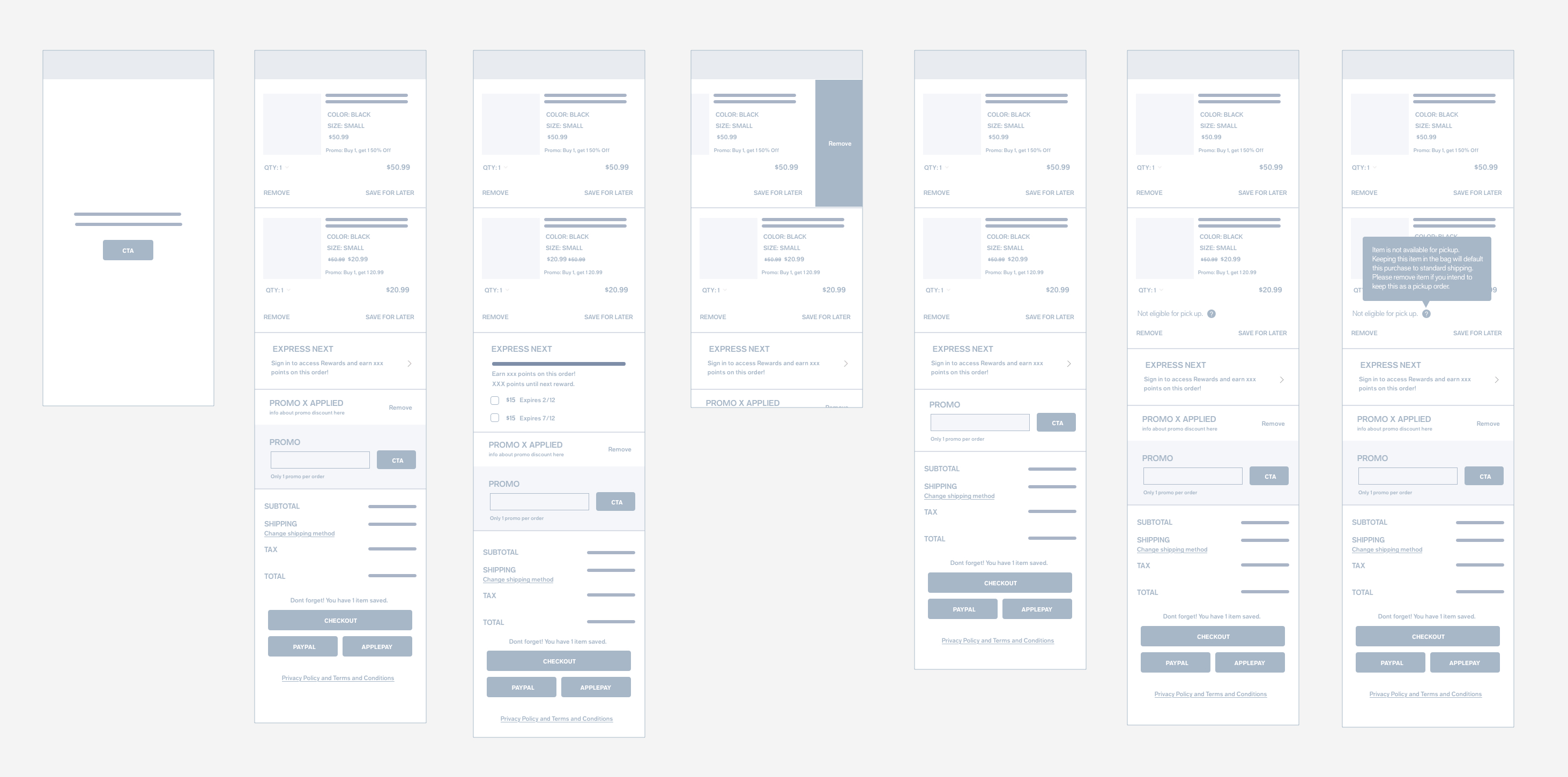
Bag
Once a user is logged in, we wanted to personalize the experience by stating their name, total points, and points for next reward, this is also the area where a user can redeem their money rewards towards their purchase. We also gave the users the option to checkout earlier with Pay Pal and Apple Pay - in this first iteration we hope to train the user to look here for a faster checkout, so that we may update that area with a quick checkout using our own brand credit card.
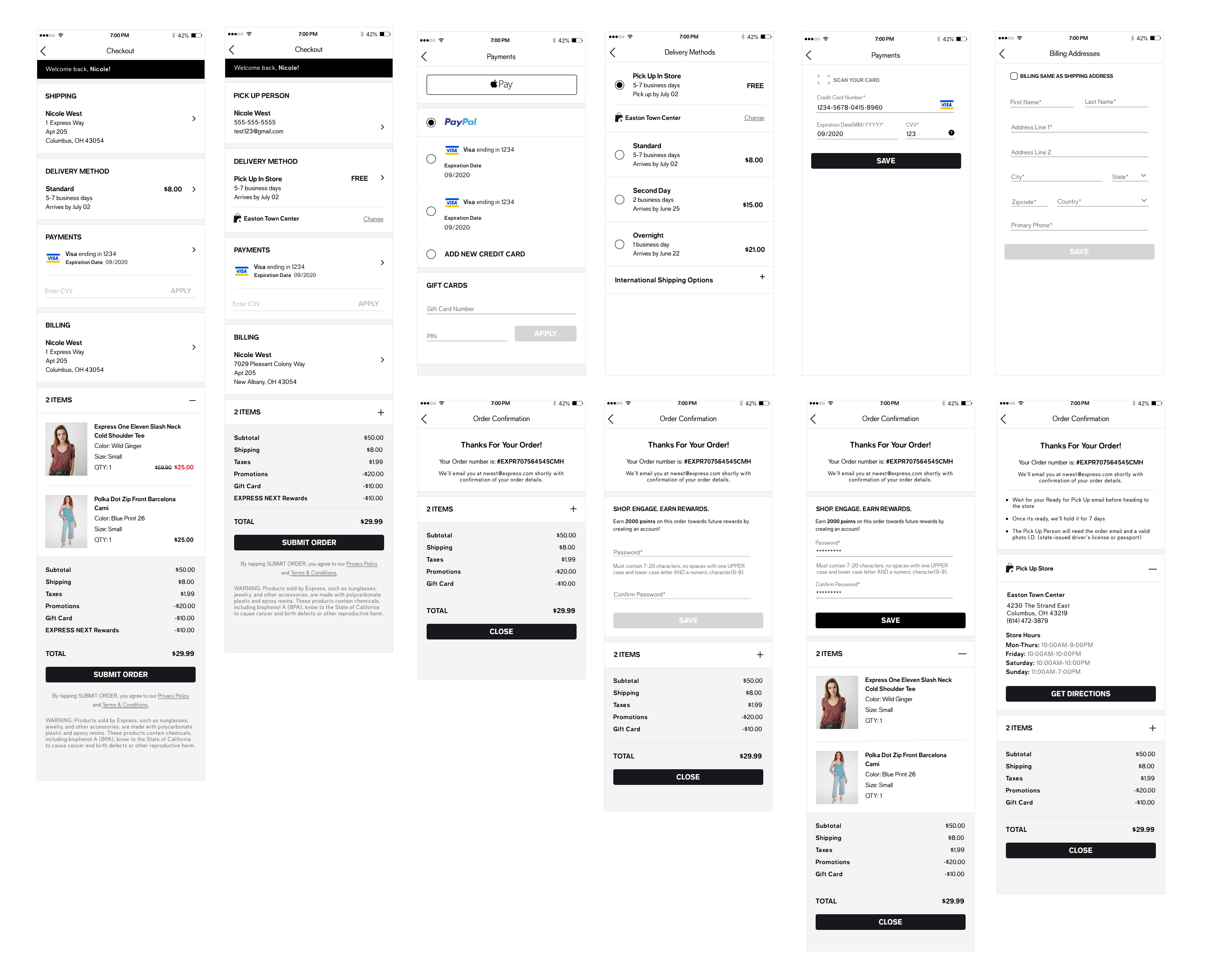
Checkout
The idea for checkout was to break down information into cards, giving the user a quick overview of all of their information. Incase a user still was not logged in at this point, we wanted to serve a small banner at the top of the page for logging in. Baymard suggests that most users who complete checkout as a guest have highest percentage of creating an account at order confirmation. We let the user know this is possible on the confirmation screen as well as informing them that they can still redeem their points for the order they just placed.
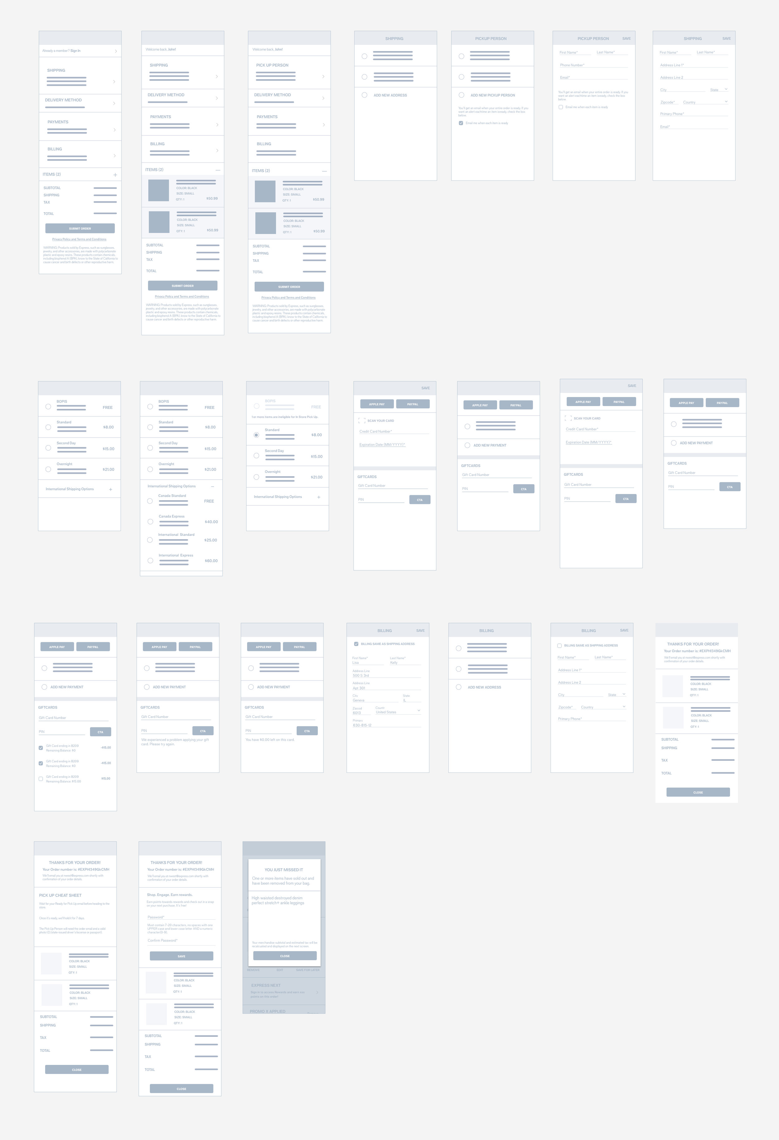
Checkout - ui
I created a card based system for each section of information, using icons when appropriate. I pulled some of our design elements from other experiences we’ve worked on to keep parity between pages.