PROJECT: HEader and NavigatioN
Platform: Desktop and Mobile Web
The Challenge: The desktop header had three tiers of navigation with a very sensitive hover. It was difficult for users to move past the second tier and it was also not ADA compliant. We also had issues with users being able to locate the login/my account area of the header.
Role: UX Designer
Header - Initial Concepts
We explored and tested different versions of what the header could be. My main goal was to let the header breathe more and to give a centralized focus on the brand rather than keeping it off to the side. We found that users liked a more simple menu and were really engaging with the iconography.
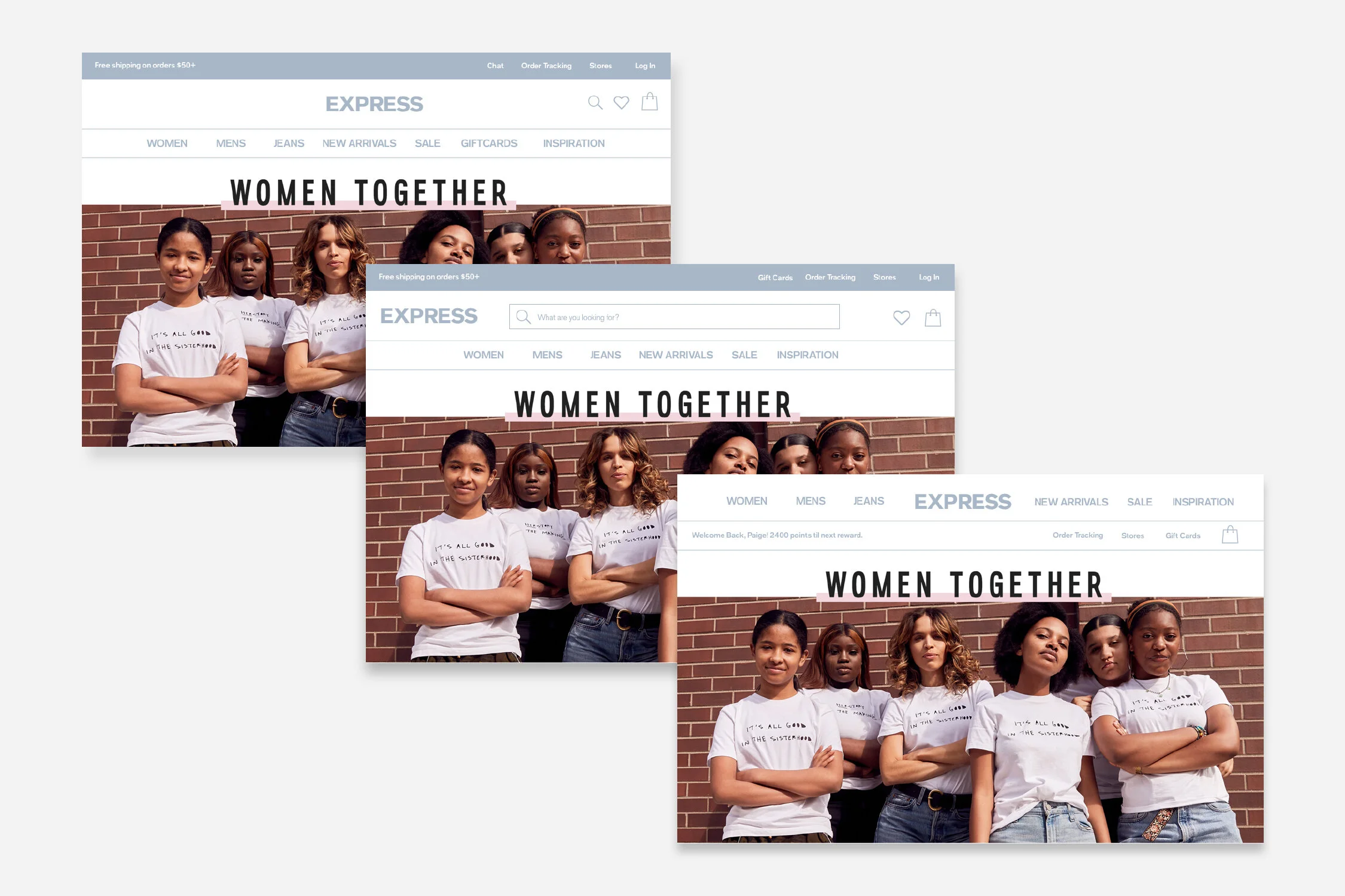
I explored (above) a 3 tiered approach at first to fit all the requirements from different internal teams. We were able to negotiate by adding a lot of information into a courtesy navigation.
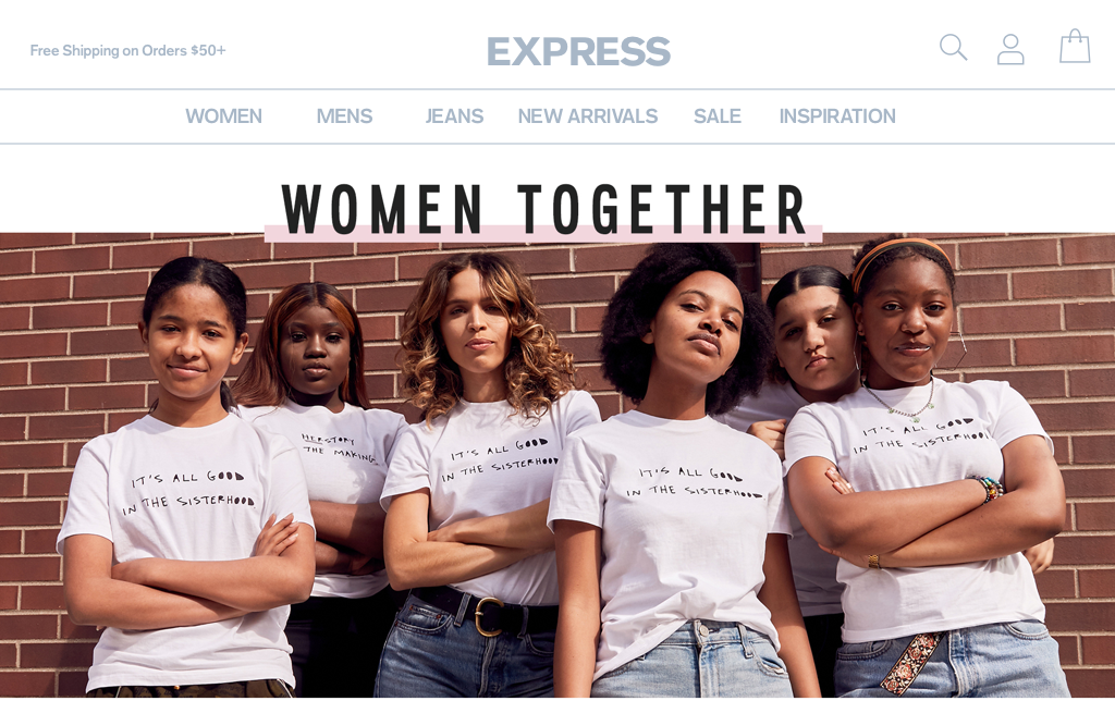
Winning header version(above). Splitting the header into two tiers of information creates a lot of flex for us and whitespace to the user. Most users gravitated towards iconography and found it intuitive and easy to use.
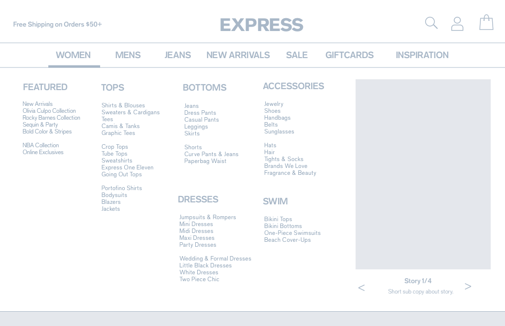
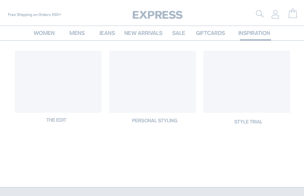
Header - Categories
Our current taxonomy is really robust and we have a lot of categories that are repeated or only filtered pages of a main category. My idea was to use a mega-menu approach and to pare down any categories that were actually a filter. We brought this concept to the merchants and were able to work together sorting through a majority of the taxonomy.
Stakeholders also requested to add a story widget on the right hand side to highlight any promotions or clothing stories we wanted to tell.
The Inspiration drop down works a little differently because there are only a few highlighted sections under it, we wanted this section to be more visually appealing. Most of the links from Inspiration take the user to material to learn and explore more or to create personal styling experiences.
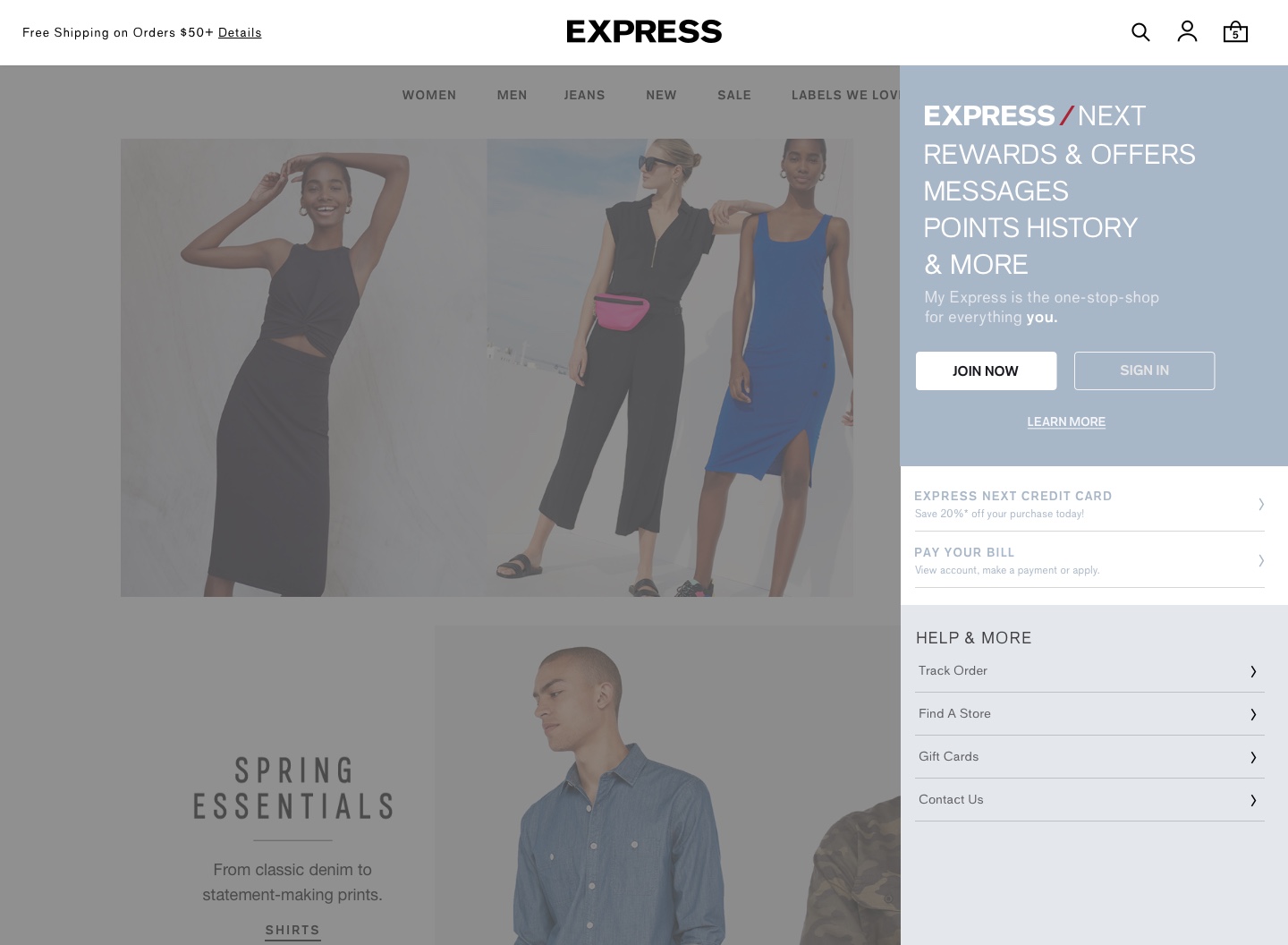
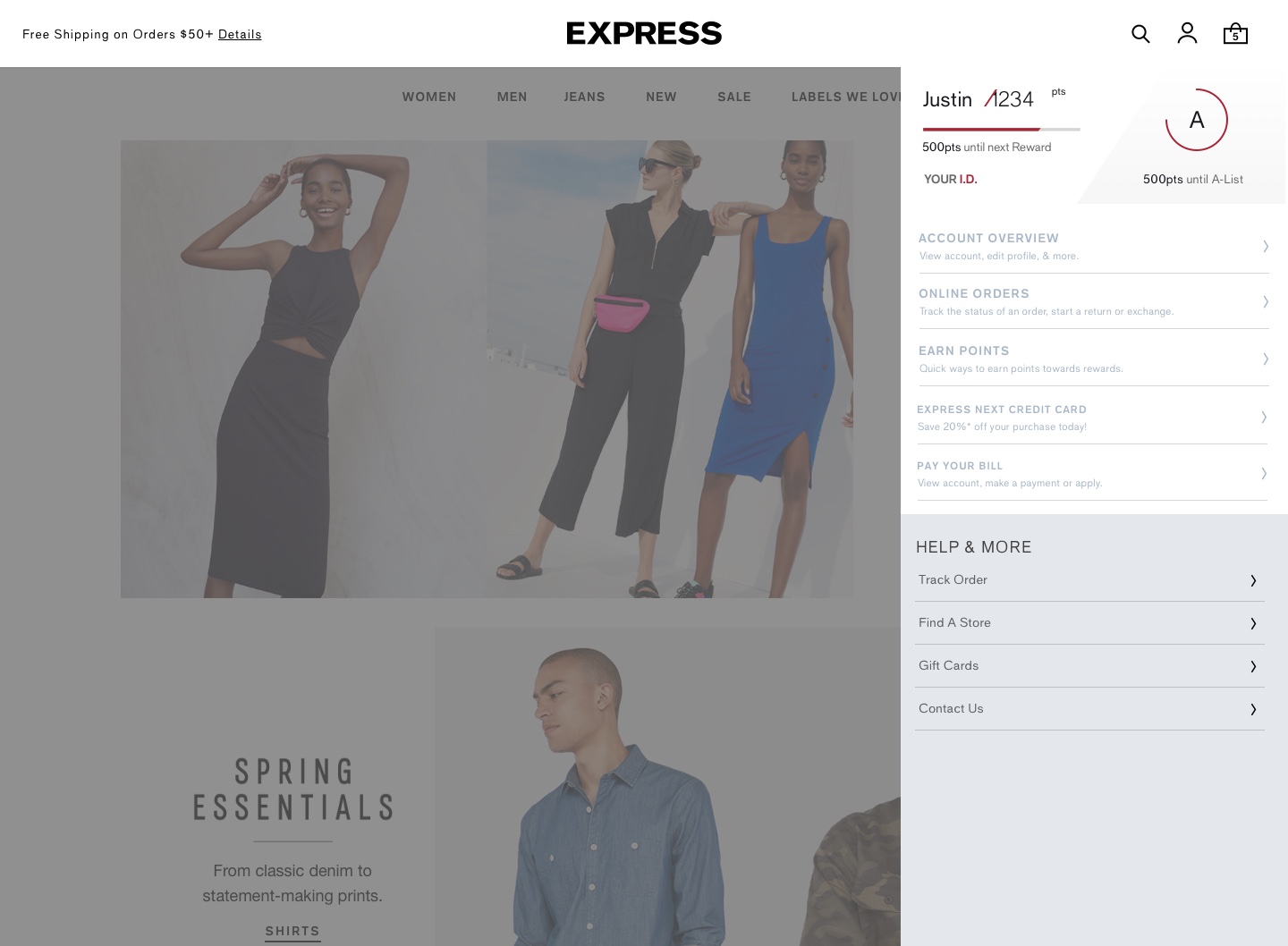
My Account - Courtesy Navigation
One of the biggest goals as a company is to increase loyalty acquisition, which is highlighted in the new account panel. This gives the user quick access to their points and rewards and the rest of their personal information once logged in.
We also did some user testing to understand if users understood where each section category took you to on the logged in view. We found that most users struggled with our terminology for most sections and that subtext helped elevate each title.
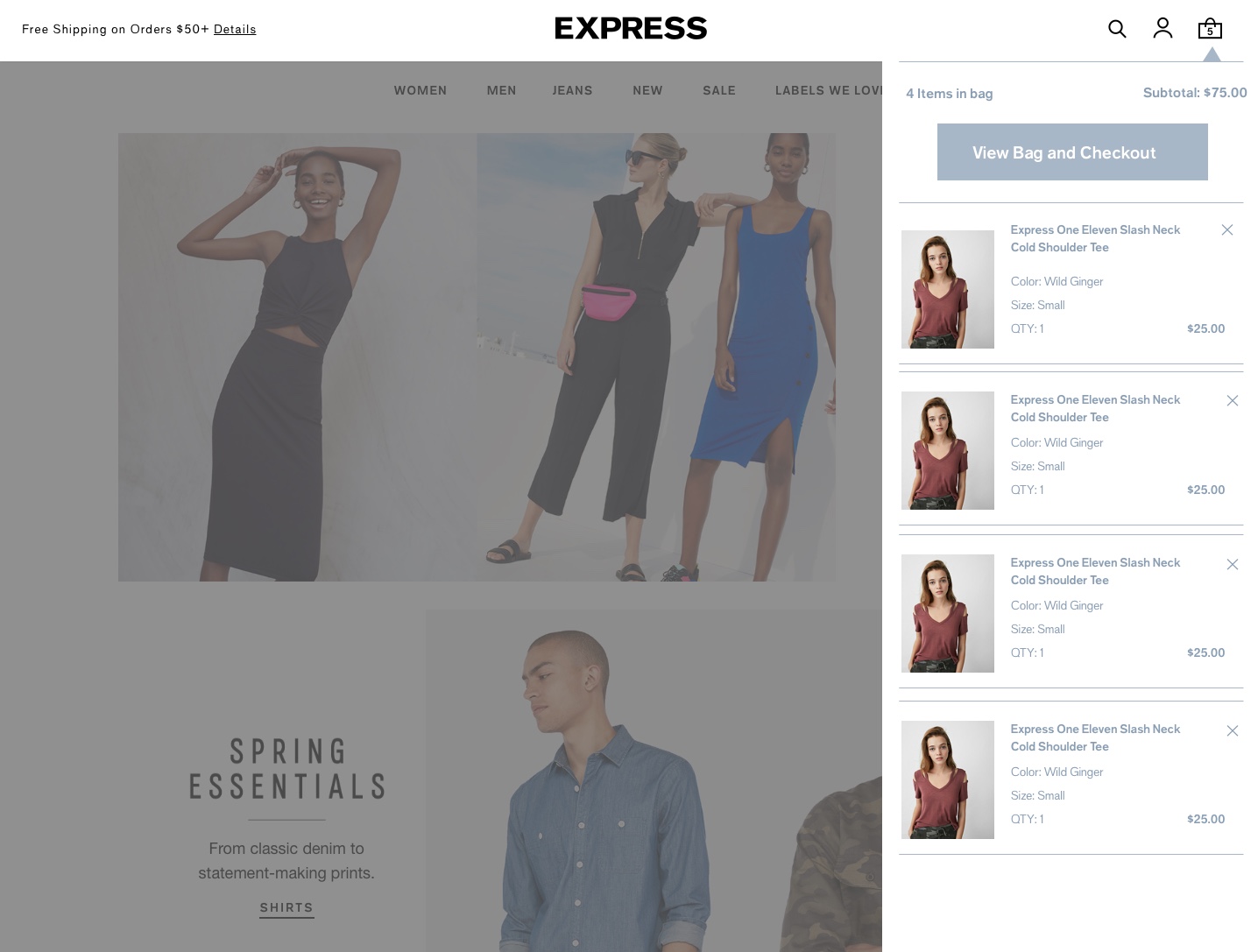
bag peek - courtesy navigation
The new bag peek offers a quick view to the users on mouse hover, with the add to bag CTA near the top for quicker access to the checkout.
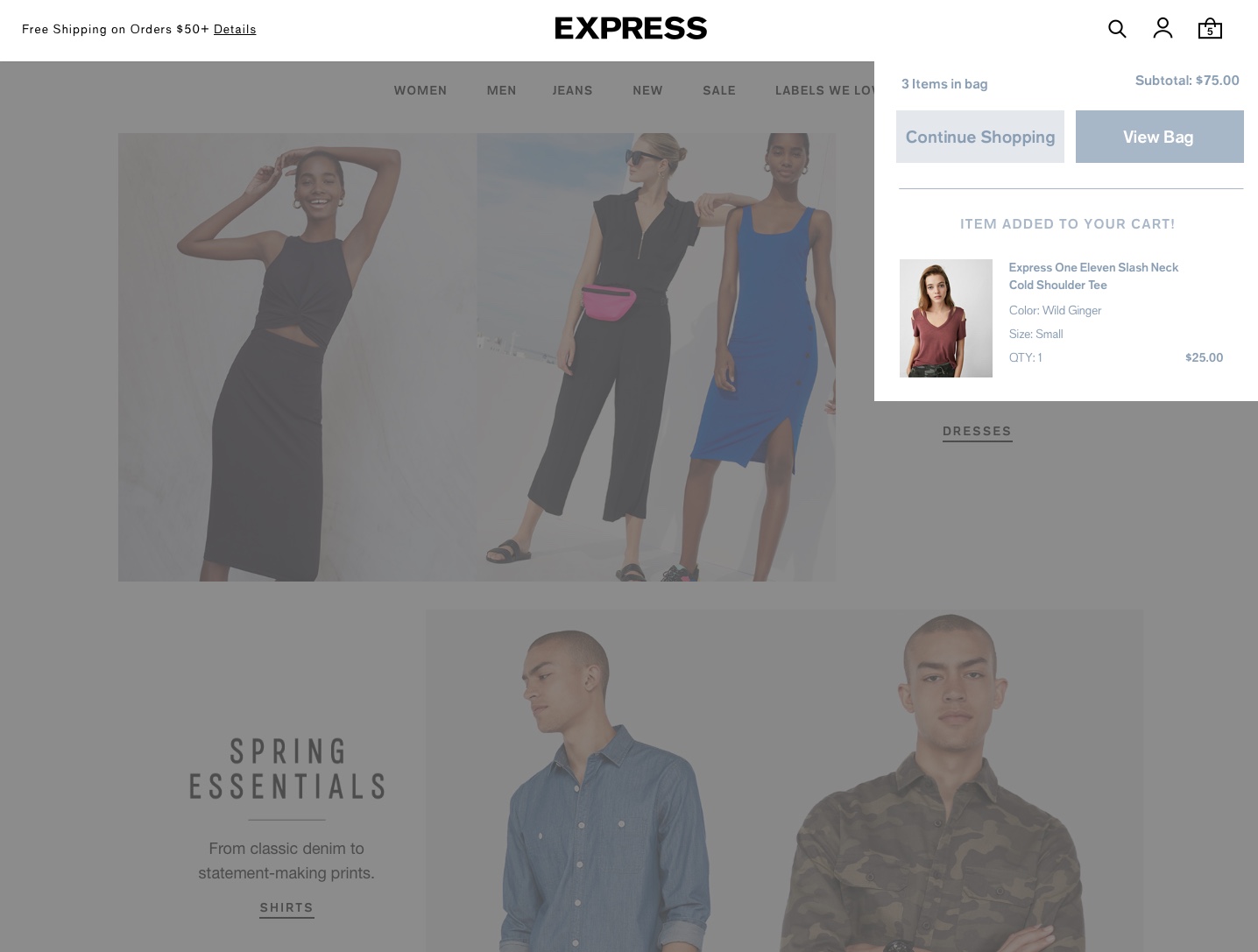
Add to bag: A quick drop down notifies the user when they add a product to the bag, which they may either tap out of or dismisses on a 5 second timer.
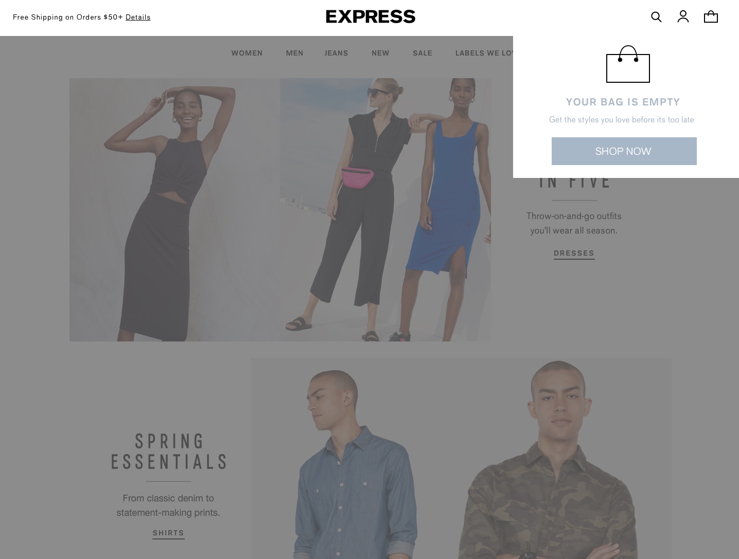
Empty bag: Once a return user hits certain criteria, a drop down notifies the user that their bag is currently empty.
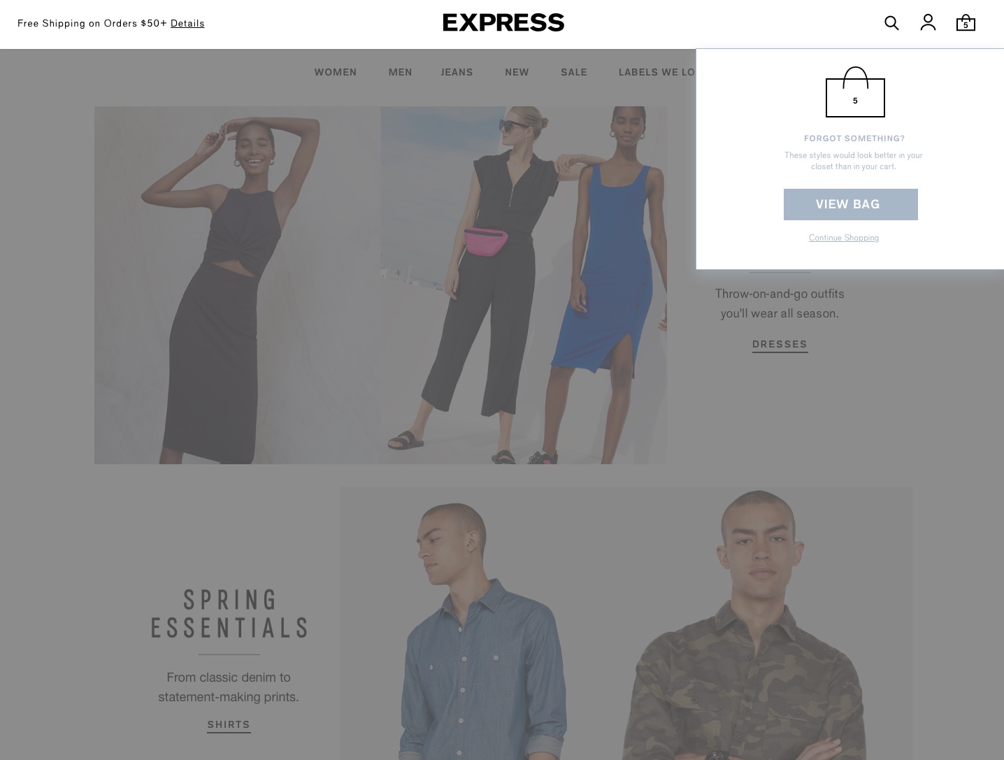
Bag reminder: Once a user returns to the site with items in their bag, we can serve them a reminder to help push conversion.