Project: PLP and PDP Redesign
Platform: iOS and Android
The Challenge: The colors, sizing, and fit were all hidden under a tab functionality, making it difficult for users to see what colors are available in which sizes.
Role: UI Designer
PDP
The PDP was a group effort to complete. UX and UI worked together through quite a few iterations and user tests to determine what the best experience would be for the user. We decided on horizontal swiping for the fit and color options to let the user easily see and interact with all facets. I followed our button designs to bring parity to our sizing and color components.
PLP
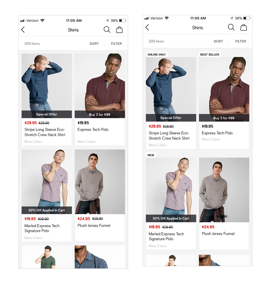
I created the PLP designs with mindfulness to material design’s card component. We had a difficult time figuring out how to show colors and promos in such a small space and ultimately decided to overlay promos on the bottom of the image to highlight the promo and save some space.
The merchant team also asked us for a way to “tag” different types of product, such as online only, best sellers, and new. After some experimentation we decided to roll out with a tabbed approach on the top of the image.

